
Certificate of Deposit Renewal
Toronto Dominion (TD) Bank, USA
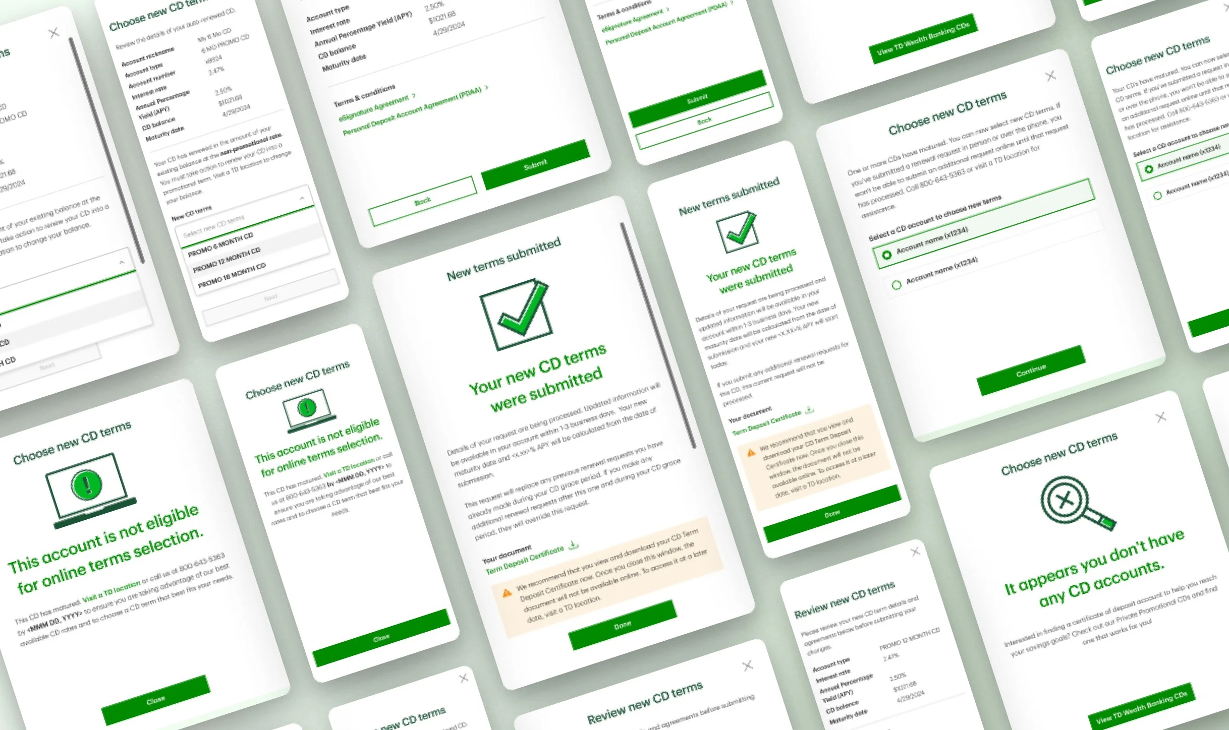
Visual and UX design for TD Bank USA, responsive net banking website and native mobile application introducing a process for users to renew their certificate of deposit for another term.
FIELD
Visual design for desktop (responsive) and native mobile application for TD Bank (USA)
TEAM
Sharmeen Aziz as part of TD Bank (Digital Customer Experience team)
+
Michael O’Reilly (team lead + UX designer), Kara Adamo (content writer)
TIME FRAME
Multi-phase project spanning from Mar 2024 to Dec 2025
SUMMARY
When a certificate of deposit reaches its maturity date, the bank typically offers the user a short grace period during which they can decide what to do with their funds without incurring a penalty. This process is often overlooked by users. Our work on this project was to provide the user with nudges in various forms informing them of their maturity period and giving them a seamless way to renew their CD for another term.
MY ROLE
I worked on this project as a visual designer. I also assisted my UX partner on ideation. My role was to determine, gather and set up multiple screens in font styles, button styles and components (from TD Bank’s robust design libraries) to plug in with the UX design. I created all the visual assets, create multiple iterations of designs, manage content creators and researchers and worked hand in hand with product owners.
REQUIREMENTS
This project was designed for desktop browser and extra-small breakpoints, which translated directly into micro UI* screens for the native mobile application. The feature was required to be an essential experience that lets the user know that their CD has matured and provide them with a process to renew their CD for another term. For MVP1 the focus was to be specifically on renewal of the CD term. The flow needed to contain happy path flows as well as error scenarios.
*micro UI is display function that translates a flow in a responsive breakpoint to independent, deployable modules to fit within a native mobile application. In short, a mobile site, fit within the frame of a mobile app.

DESIGN & TESTING
For the visual designs on this project I assembled core elements like typography, button styles, iconography, component styles and other design patterns from TD Bank’s design system libraries and laid them together into functional screens and flows. I created these screens for desktop and XS sizes. Subsequently XS screens were plugged in to mobile frames as a micro UI experience on TD Bank’s mobile application.
As soon as this flow was visually ready, we geared into a testing phase to make sure users understood and accepted this flow, and to gather essential feedback for MVP2 which was the next phase of this project. I was in charge of creating prototypes for testing, working hand in hand with researchers. I also assisted by observing user interviews and evaluating first-hand how users feel about the experience. As the last step, I supported synthesis of research findings to better design the visuals.